Colour is just more than a visually pleasing experience. Colour is in fact a mysterious language which is more complex than most would think. Colour has the ability to evoke feelings, emotions, spark interest, increase appetite and persuade ones mood. When designing an interior space its important to grasp how to use colour which you can view more in our last post here.
With the advancements in technology we are now spoiled for choice as we have access to so many ways to increase our colour pallet. It’s important to carefully select your colours and stick to a simple selection rather than over complicating it. In this article we will offer you some helpful tips and advance as to how you can find inspiration for choosing colours on your next project.
1.) Capture it
Now most of you by now would have a smart phone with a pretty reasonable camera so whilst going about your every day whether you’re at work, going for a walk or on holiday remember to take notice of whats around you and capture it. Photography is a fantastic way to create an album of imagery which contains a variety of colour inspiration. If you have photographs with a colour scheme that catches you’re eye, then use it as a colour pallet. Programs like Photoshop or online applications like Photocopa make are a great way to build a pallet in the blink of an eye.


2.) Save it
Most of us are on our phones or computers for hours on end now days using apps like Pintrest, Instagram, Tumblr etc..Create a file and fill it with images that contain inspiring colour schemes which you can use as a reference. There’s so many places you can find inspiration, whether its from contemporary art and design, historical paintings, new or old photography, print media and fashion design.
An inspiration folder doesn’t just have to be confined to your computer. Hold onto any images you find in magazines, books or articles by filing them away so when you’re working on the next project you can dig it up and have a sift through.

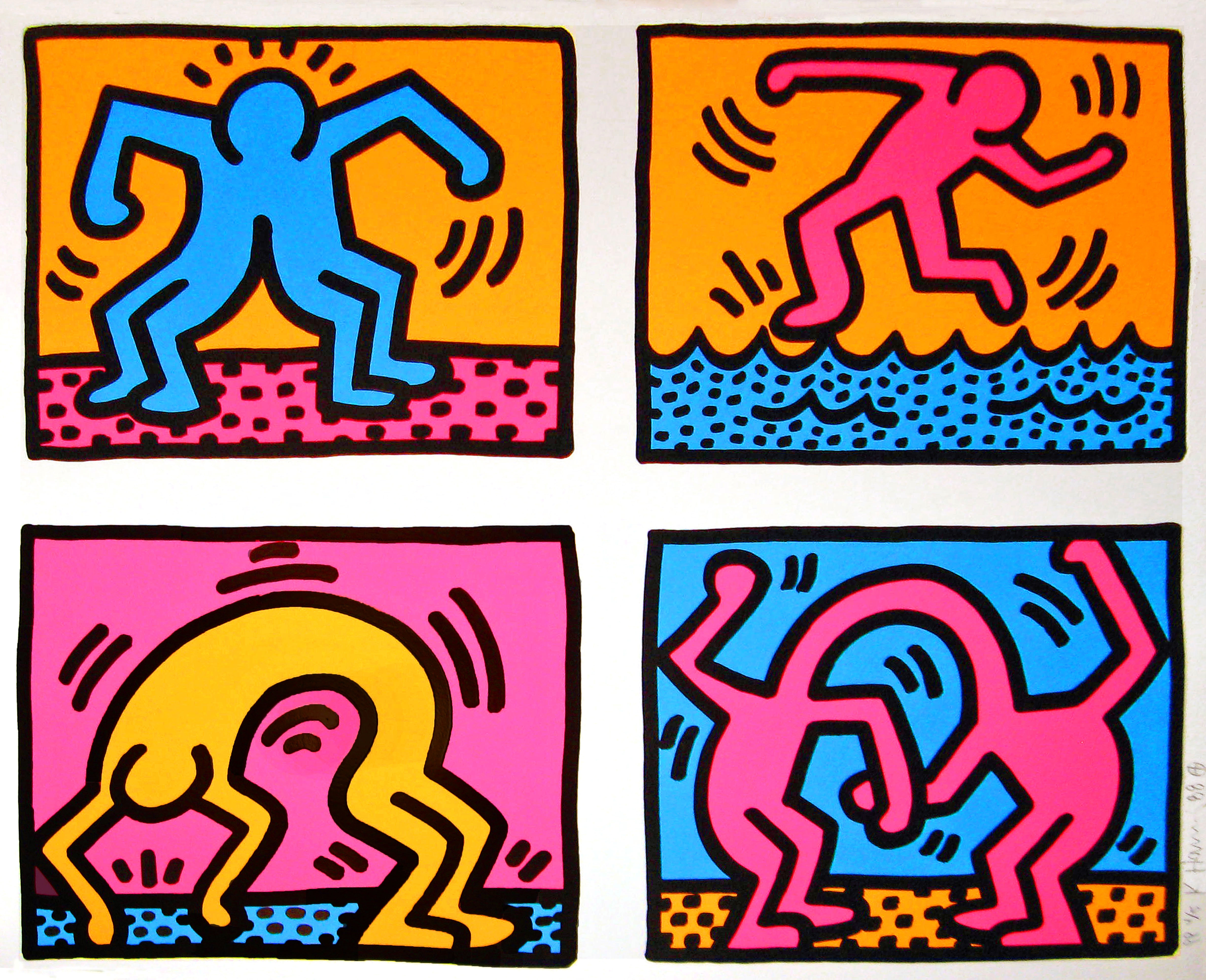
Keith Haring Artwork.

3.) What is your mood?
After you have established what the purpose of the room is its a good idea to consider what mood you’re trying to achieve. Try and work out what mood would be associated with the purpose of that mood. If it’s a kitchen space in an office environment you might want to consider colours that evoke appetite like reds, oranges, yellows and combine it with open white space creating a refreshing clean environment.
If it’s a quiet reading room for people to unwind and relax consider using soothing tones like blues, soft greens with subtle earthy tones making sure that its not to saturated and jarring.
When trying to pick out the right colours its helpful to describe them poetically, for example you might say “I’m searching for a vibrant romantic purple” or “I need to find a sunset orange” or “The room needs a hint of cute pink”.
Keep all of your design inspiration, photographs and cut outs on hand when searching for the right mood as this can help develop the right tones, ideas and emotions you’re trying to portray. There’s also a large amount of psychology associated with selecting the right colours so it’s a good idea to look into what colours are associated with certain subconscious thoughts and emotions. You can read more about that in our other blog post here.


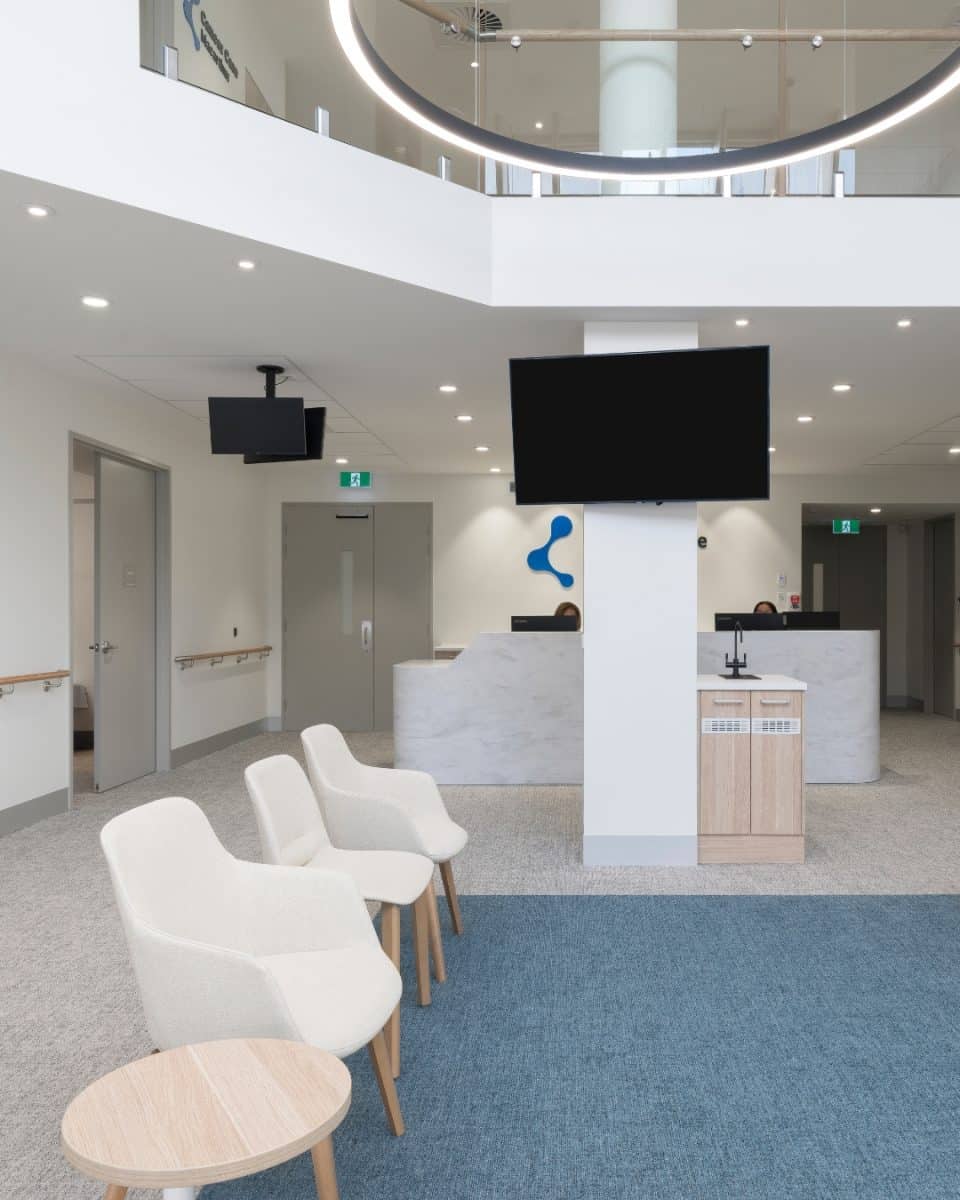
4.) Keep it simple!
The things in life are often the most simple. This apply’s to design as well, so when you’re trying to find what colours will suit your next room or project stick to 3 or 4 colours. You want the space to look clean, welcoming and inviting so people aren’t overwhelmed. If you choose you’re 3-4 colours wisely a good way to add more variation and contrast is to also consider texture. There are many ways you can achieve this by selecting the right fabrics, paints, objects and surfaces.
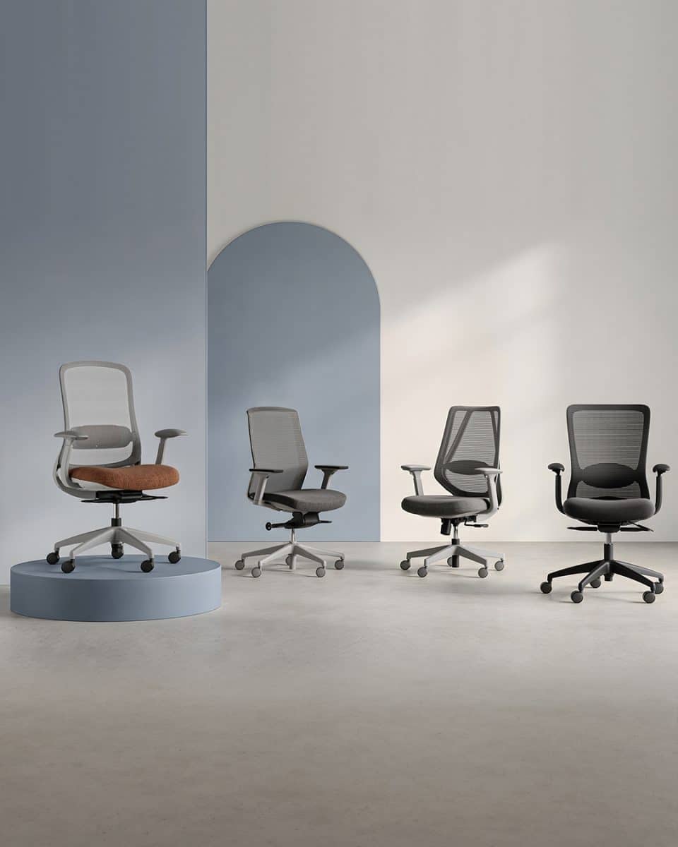
In the picture below you can see how the simplicity of just 3 colours works so well in a way that doesn’t over complicate things. If you find yourself looking at the room you’ve designed ask yourself why it might not be working for you. Quite often it’s the colours chosen so it’s probably a good idea to cut down on the number you chose.

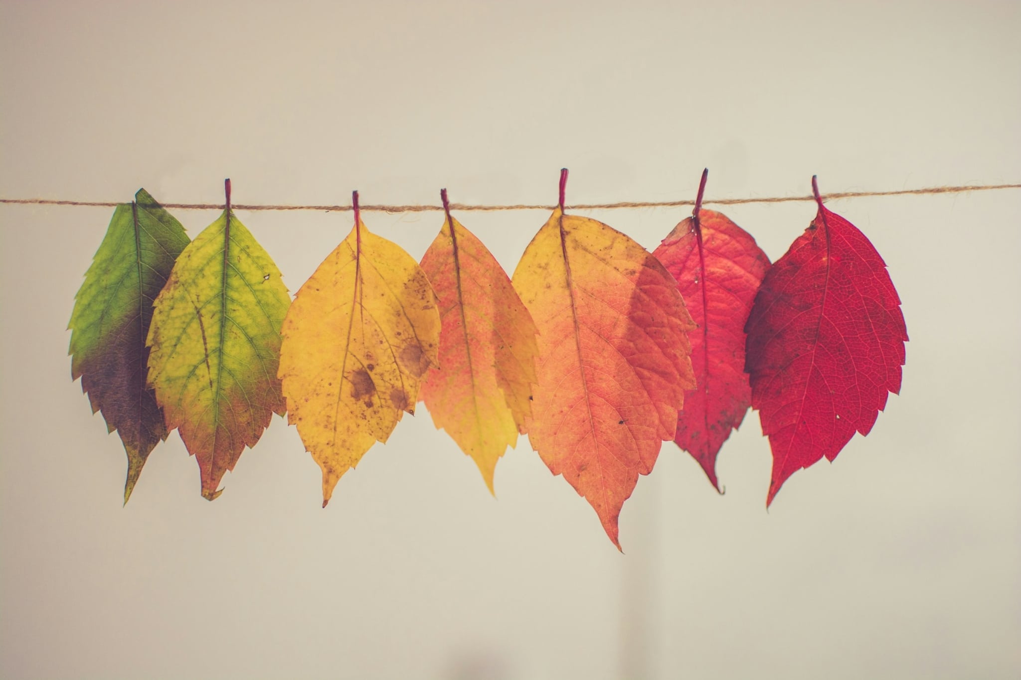
5.) When nature calls
Take a moment to look outside the window, then start to analyse how much colour inspiration you can get from just that one image. Open your eyes and your front door and explore the world around you!
If you take inspiration from nature and the environment around you its no surprise that you will be bombarded with and endless supply of inspiration. The combinations of colours are infinite, whether its landscapes, mountain ranges, plants, fruits, water ways, urban streets, food, the sky and the list goes on.
Below is a range of different images where 4 different relative colours have been extracted from them to show you how well the colours harmonies with each other in that particular environment.

Online content on our computers are often a trap so its important to switch off for a moment and get outside in the open air as there’s a whole world of inspiration out there.